Assignment three Colour

Task

This assignment is about showing command of colour in photography, being able to find and use different colours in deliberate relationships.  It should be possible to identify at least two kinds of colour relationship.

  • Complementary (colours that face each other across the circle)
  • similar (those near each other, as in cool or warm range of colours)
  • Colours spaced about a third of the way around the circle: very different from each other, but not quite complementary.  Blue and red are an example, as are green and orange.  This kind of combination has a strong contrast and they might even be considered to clash with each other.  Using this kind of relationship is not particularly harmonious, but is certainly eye-catching
  • A fourth kind of relationship is when one small area of colour sits against a much larger background of another colour as a spot or accent

Four photographs are required (16 in total) that illustrate the following colour relationships:

  • Colour harmony through complementary colours
  • Colour harmony through similar colours
  • Colour contrast through contrasting colours
  • Colour accent using any of the above

The subject matter should be varied, including both arrangements (eg still-life) and found situations.  Make use of both lighting conditions and filters to help create the colours being sought in some of the photographs.  Make notes about the ways in which the colours work in each image and make a sketch for each to show the balance and movement.

Include a self-assessment of the work against the criteria given in the course manual.

Research

My first concern was regarding the overall approach to this assignment; whether to decide at the outset what I would go out and look for in respect of the ‘as found’ scenes based on previous excursions or go walkabout and be inspired by what I might find; it was difficult enough finding natural scenes for the exercises in this section.  Considering the high probability that I would waste time searching for preconceived ideas I opted for the ‘walkabout’ option.  Clearly still-life scenes needed some prior consideration to enable something sensible to be put together.  Technically I felt pretty confident about the ‘as found’ shots, but not so much so for the still-life scenes which I still find a challenge both in composition (it doesn’t come naturally!) and lighting.  As such, I spent some time looking at examples of still-life images by both photographers and artists on the internet, both to find inspiration for subject matter and composition.  Having had extensive comment on Assignment two from my tutor regarding post processing and the need to get to grips with this aspect of making a photograph I also spent a good deal of time reviewing my workflow in Lightroom in the pursuit of images that ‘sing’; I have to admit that although I was able to define the process to follow the degree of alteration of the various parameters still remains a concern as there appear to be so many differing views in the articles and books I read.

Outcome

All photographs were shot on a Nikon D600 and in most instances I set a custom white balance using a grey card, resetting when the light changed.  I have developed a number of custom camera profiles (not sure I have totally got my head around how many of these you should generate) using a ColorChecker Passport which I apply as the first stage of post-processing in Lightroom along with lens corrections.

Colour harmony through complementary colours

This is the stern of a particularly gaudy barge which provides a good example of complementary colours.  It was difficult to compose the shot to get the ideal ratios both due to the position of the barge and the extent of red in the railings and rudder gear. However, as indicated on the sketch, I think the proportions are about right.  I am unsure about depicting the movement in this shot but I think the railing moves the eye around the picture whilst the tiller handle implies direction.   Post-processing consisted of adjusting the exposure, black clipping and shadows, increasing clarity and vibrance to bring out the detail and texture and finally adjusting the tone curve to add contrast.
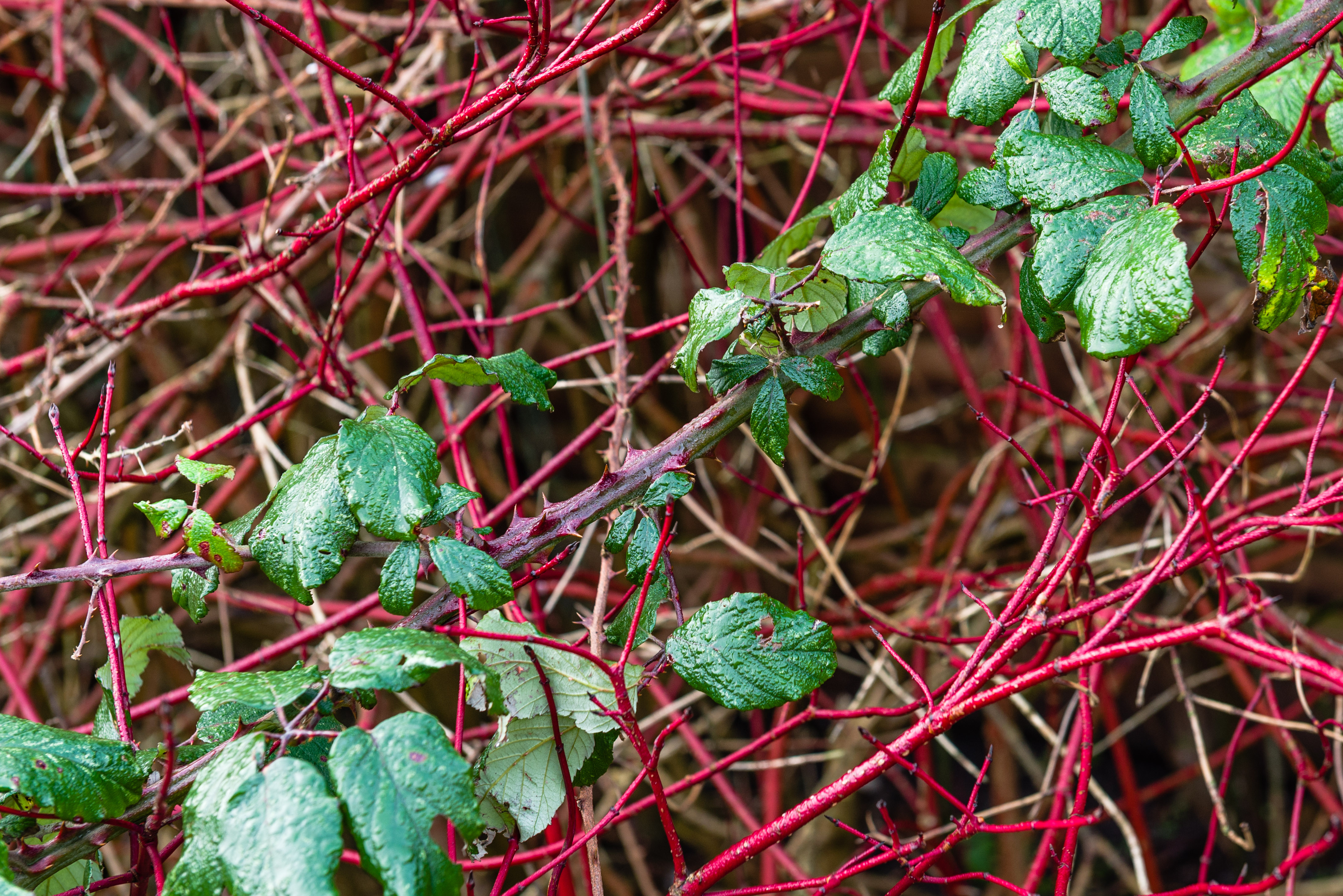
Spend enough time on Shanks’s pony and you can still find some of nature’s finest. Composition was the first challenge here, not least having to work my way into the bush to get the right viewing position.  Also, in trying to gauge the red and green proportions I found the berries very deceptive in terms of a bulk of colour, if that makes sense.  Once I got this shot up on-screen it was obvious that it was in need of some cropping, not a surprise to me.  I then decided to try a different white balance which I found delivered a better result. There are a good many shadow areas so some adjustment of the black and shadows was applied after having tried some exposure adjustment (reset to original).  Some increase in clarity and vibrance brought up the saturation and detail but I still found the colour of the berries to be wrong to my eye so I applied some saturation using the HSL panel slider.

I could not believe my luck when I turned the corner and saw this building; admittedly the orange facade was considerably larger than the blue shop front, which was the wrong way round for balance, so cropping was the order of the day.  I also felt that having the pastel coloured building alongside made the orange and blue more prominent, hence giving the blue more presence than it would have had otherwise.  It is notable that I discounted the colour in the windows of the blue-fronted building due to the difference in hue – I may be in error here but it would be a matter of adjusting the crop to get the ratios right.  In Lightroom I dropped a half stop in exposure before adjusting the highlights.  As usual I increased clarity and vibrance which, in particular, I found to bring out the endearing shabbiness of the building giving character, and added contrast in the tone curve panel.

The dreaded still-life!  I think it works insomuch as depicting an activity, heading out of the front door for a run, although on reflection it is perhaps a bit stilted; probably in trying to get the proportion of the yellow correct.  I positioned the articles near the front door in the hope that the light falling on one side conveyed the impression that we were heading to the great outdoors, also indicated by the diagonals of the floorboards, but this caused me problems with the overall exposure, even though I tried using white card as a reflector.  Post processing started with some cropping, reducing the exposure by 2/3 of a stop, increasing clarity and vibrance and finally adding contrast in the tone curve.

Similar colours

A classic case of being ready for the unexpected!  Whilst considering a shot in a different direction I caught this out of the corner of my eye and had little time to capture the moment as they galloped off into the distance in the rain, hence not as sharp as I would have liked. However, for me, it contains all that is asked for, similar colours (notwithstanding the coloured pillars in the background) and movement, all within the mood of the day which was dank and overcast.  In post-processing I spent some time cropping the image trying to determine whether more of the background should be included to put it into context; I think this provides enough space for them to ‘run into’ whilst emphasising the colours of their kit.  I reduced the exposure slightly, adjusted the black and white to eliminate some clipping and added clarity and vibrance and adjusted the contrast; the processing challenge here centred around the pink shirt.

Amazing what you can find in the dry(!) dock of the SS Great Britain.  To my mind a prime example of nature’s colour variation.  The fact that there was a slow trickle of water flowing constantly provided the sheen which caught the eye and emphasised the textures and hues.  On reflection I should have gone for a smaller aperture to give a greater depth of field, the light was not too bad so a modest increase in ISO would have enabled this.  The image also portrays the movement of the water by way of the lighter areas and erosion of the stone.  In LR I spent some time adjusting the exposure and dealing with the consequent black and white clipping then applied some clarity and vibrance increase which, coupled with strong contrast adjustment, brought out the colour variations and textures.  A real indicator of what nature can produce if left to her own devices.

One of my favourite buildings in Bristol not for its architectural excellence per se but the glass finish which has infinite variations as the light and viewing angle changes.  I shot the whole building with view of cropping later as I could not make up my mind at the time how much was required to best illustrate the similar colours and in the knowledge that vertical correction crops the image.  Indeed, when you get the image on-screen you really see the colour variation.  There was also the issue of converging verticals given the viewing angle.  Once in LR I applied the vertical correction and then applied much cropping to achieve the desired result.  I was then faced with a pretty drab, flat image and instantly recalled my tutor’s comment about making an image ‘sing’ – how to achieve this, had I picked a bad one here given my less than honed LR skills?  This is the result of much ‘fiddling’ with exposure, clipping, vibrance, clarity and contrast.  I have to say that this is perhaps not what the building looked like on the day but more what it is capable of looking like.  This is perhaps one image I expect will attract significant comment in assessment but feel it is warranted including to get that feedback – have I gone too far?

This was one still-life that I had determined to do having seen something similar before, although a lot more striking – walk before you run.  Not only does this product seem to have an infinite variation in shades but I think it lends itself to still-life.  Nevertheless, it is amazing how long it can take to arrange 3 bottles to one’s satisfaction!  Early on in the proceedings I learnt how all manner of stuff shows up on a black background.  I experimented with both ambient light and flash and found ambient to deliver a better effect; having the camera tripod mounted eliminated any concerns about long exposure times. All shots were taken with mirror up and a remote shutter release.  I followed my post processing routine but found myself revisiting settings time and time again, this image has the longest history record in LR.  Much of my difficulty was around the blacks and shadows and I think this is still evident, particularly in the black cloth in the foreground.  I do not regret having a go at this but there is obviously much more to learn about shooting still-life and the backgrounds used.

Contrasting colours

Clearly I would not make it as a shop window dresser, or whatever the technical term is. However, I think this makes a very striking contrast, despite the hue of the gloves, and putting the ensemble on a white background really makes the subject stand out; I also think the ratios are about right given the Von Goethe scores.  Again, with this still-life I tried using both ambient and flash and, despite my usual dislike of flash, it seemed to deliver a better image; this makes me think that there is something in the choice of lighting for different colour and background combinations.  This flash set up was something new for me having been given an “Orbis” for use with my external flash; it seems to do what it says on the can.  In LR I carried out minimal cropping and some spot removal on the white background before addressing some white clipping and shadows ( I guess you still have to be selective with the Orbis to minimise shadows) before applying a strong contrast adjustment.

This appealed to my sense of humour as well as appearing to be a fairly simple set up to further address my still-life phobia.  I think the sum of all the triangles in the sketch gives about the right ratios of colour although I have not consulted Pythagoras.  Certainly the colour contrast is eye-catching.  I opted to take this shot under normal domestic lighting having first set a custom white balance.  In post-processing I followed my usual workflow but again I had some issues with the black background; a final application of strong contrast and adjustment for black clipping seemed to resolve the problem.

Somewhat unusual to see such neat scaffolding, but a perfect shot for contrasting colours and one of the few scenes which was easier to gauge in terms of the ratio of colours.  As I have found with taking shots of buildings, getting the viewing angle is a matter of trial and error as a small change in position seems to make quite a difference in the outcome; I guess a tilt/shift lens may make things easier, or access to alternative viewing points from buildings opposite.  I would have preferred to have been able to crop out the lamp post from the edge along with the majority of the sky in order to really home in on the main subject.  In LR I followed my normal workflow, reducing exposure a bit which then required some adjustment of shadows and highlights, increasing clarity and vibrance and finally applying some strong contrast.

I very nearly missed this scene whilst on walkabout in Bristol.  It was a view down a narrow alleyway behind an iron gate; it may not deliver the colours in the ideal ratio but I think the composition makes up for it – well it does it for me.  I took a good many shots in an attempt to get a pleasing composition and tried different metering options shooting down the dark alley; I was aware that post-processing could address some of the issues but I wanted to get it right, as far as possible, in-camera.  Reviewing my shots in LR identified one shot with potential.  I revisited virtually all the adjustments a number of times, mainly around how much detail in the alley should be revealed bearing in mind I was after taking the viewer to the cars; I think the path does that, coupled with the bright yellow car.

Colour accent

I found it difficult to find accent examples in the natural landscape at this time of year.  This shot necessitated a particular viewing angle to create the accent, hence its position close to the edge of the frame; I think the composition is aided by the confusion of the diagonals of the branches running across the frame.  In LR I reduced the exposure slightly, reset the blacks and whites, increased clarity and vibrance and finally added contrast to make the red leaves stand out.  To me the final image, whilst portraying accent, gives the impression that the branch that the red leaves are on is coming out of the photography.

I will own up to this arrangement being suggested by my wife.  Not only do I like the rich colour contrast but I get a real feeling of the texture of the chair and handbag.  The way the bag sits and conforms to the chair seat and the creases in the leather conveys the collapsing of the bag as it is put down and settles into its own shape within the confines of its envelope.  I did try a number of compositions including more of the chair but that somehow detracted from the two contrasting colours and the texture of the leather.  In post-processing the main area of effort was in achieving the right saturation of the colours.

I debated with myself the inclusion of this image; did it meet the criteria as the red panel could be considered to stand on its own rather than against another colour background. However, I concluded that overall the red panel formed part of the overall backdrop of blue. If the intention of the owner was to make the boat stand out without the overstatement so often used then this works, the eye is drawn to it even with the pastel colour of the building behind.  Once in LR I carried out some fairly drastic cropping due to the inclusion of a lot of dead space in the foreground due to the single lens I had with me.  It took me a good deal of tweaking to get to the final image, mainly in making the boat stand out, the original image being very washed out and lacking in detail.

I guess the first comment on this image will be around the closeness of the accent to the frame.  I tried a variety of compositions using the rule of thirds but none really seemed to provide anything that cut the mustard.  I selected this image due to the fact the trail through the grass leading to the bridge is fairly well defined and provides a leading line to the accent; then across the bridge and through the hedge you can see yet another patch of green implying another wide open area and the question “I wonder where that goes to, what’s on the other side?”.  In LR I cropped the image and decreased the exposure by half a stop then lifted the shadows to reveal some detail.  Clarity and vibrance were increased before adding some contrast to lift the image.

Reflection

I found this to be a challenging but satisfying assignment; it was indeed difficult to find naturally occurring colour combinations to meet the requirements of the assignment and my still-life phobia did not help.  Turning now to my self-assessment against the given criteria.

Demonstration of Technical and Visual Skills.  At the highest level the main challenge was applying all the previous learning whilst addressing the specific requirements of the assignment.  As more knowledge is gained it becomes more and more important to stop and think before pressing that shutter release; using a tripod encourages such a way of working but it is not always practical eg photographing in a city, so one has to build the self discipline and confidence to take your time, even when in public – I was only questioned once on this assignment, when taking a shot of moss on a tree; was I some sort of private eye!  I have learnt a lot about the use of colour but as yet am undecided on the use of specific ratios based on the Von Goethe principle.  I think we have much concept of the use of colour hard wired into us already, we react to complementary, contrasting, warm and cool colours without really thinking.  Nevertheless, this is about how to compose a colour image so as to convey your message, emotion, whatever, to the viewer and I don’t think a one size fits all as we humans are all slightly different in our colour perception, at least we are in this house when discussing various hues.  I found it a challenge to eyeball a scene and instantly see a composition that would work best if the colours were in proportion thereby either inducing harmony or tension; I’m relieved that there is no single ‘correctness’. Notwithstanding this I now find myself looking at colours and their use with a more critical eye, as well as appreciating more what nature has to offer.  I think that, visually, I have demonstrated an ability to identify photographs that meet the criteria for the assignment although I have struggled with the concept of identifying ‘movement’ in some of the images and I would appreciate feedback on this area as I may be missing the point.  Technically I have put into use functionality in my camera that I have previously only touched upon, specifically, the use of Live View, manual settings and  also more use of a hand-held light meter.  Following feedback on my last assignment I have spent a lot of time gaining a more in-depth understanding of using Lightroom for post-processing and I believe my photographs now have more punch.  However, I still feel I am a long way off mastering this tool, particularly in terms of understanding what particular or subtle tweak will render an image a cut above the rest or make it ‘sing’.  There are areas where I am very wary of treading as a little knowledge can be dangerous.  It is all very well looking at the works of notable photographers but how to deliver that through post-processing is another matter – I trust it will come with experience and my tutor has started me on the road of understanding through his feedback on Assignment two.  What this assignment has really punched home is that even with all the technology in today’s cameras they cannot replicate the image imprinted on our brain and there is a need to apply further technology in the form of post-processing to make a photograph more akin to what the eye saw or would see; many of my friends and family wonder what all the fuss is about, “look what I took on my phone”.

Quality of Outcome.   I think I have delivered an assignment that contains better images than previously presented, although this time it is colour rather than B+W so there will no doubt be areas where there are opportunities to improve, be they minor or major.  I consider my Learning Log to be clear and comprehensive and reflects my thinking and learning and is easy to follow in its structure.

Demonstration of Creativity.   I think I am beginning to come to terms with the meaning of this criteria after some sound advice from my tutor, however it still bugs me.  Insomuch as this assignment required images that demonstrated certain relationships between colours I believe I have identified a suitable range of subjects in the ‘as found’ category as well as still-life shots.  On reflection I wonder whether it may be better to try to take a lead from the images produced by notable photographers rather than seek to be ‘original’ and over time this will help me to define my own direction and style.  At the moment I feel I am in grasshopper mode.

Context.   The wider reading and comment on work I have been looking at remains a major weakness in my learning log and, I am sure, is linked to my concerns around creativity.  I have set myself a goal of producing one blog entry per week making comment on work I have been looking at.  There is no shortage of photographers to study as my tutor very kindly produces suggested reading/viewing lists.  JDI!

Overall this has been an enjoyable assignment and I feel that I have learned a lot.  I look forward to my tutor’s report.

Bibliography:

Douma, M. (2006) Goeth’s color theory. Institute for Dynamic Educational Advancement, Washington, DC. Available from: http://www.webexhibits.org/colorart/ch.html [Accessed 22 January 2014]

Freeman, M. (2012) Michael Freeman’s photo school digital editing. Lewes: The Ilex Press Limited

Freeman, M. (2007) The photographer’s eye: composition and design for better digital photos. Lewes: The Ilex Press Limited

Freeman, M. (2013) The photographer’s eye: a graphic guide. Lewes: The Ilex Press Limited

Google. (2014) Images for contemporary still life photographers.  Available from: https://www.google.co.uk/search?q=contemporary+still+life+photographers&sa=X&rlz=1C5CHFA_enGB524GB525&espv=210&es_sm=91&tbm=isch&tbo=u&source=univ&ei=GlfmUq-lLcSyhAe85IGgAg&ved=0CDYQsAQ&biw=1280&bih=595 [Accessed 12 January 2014]

Google. (2014) Images for still life photographers.  Available from: https://www.google.co.uk/search?q=still+life+photographers&rlz=1C5CHFA_enGB524GB525&espv=210&es_sm=91&tbm=isch&tbo=u&source=univ&sa=X&ei=TlHmUsnrL-q47AaijoCoDQ&ved=0CEMQsAQ&biw=1280&bih=595 [Accessed 12 January 2014]

Haas, E. (2013) Color.  Available from: http://www.ernst-haas.com/colorGallery04.html [Accessed 3 January 2014]

Kelby, S. (2012) the Adobe Photoshop Lightroom 4 book for digital photographers. San Francisco: New Riders

Colours into tones in black-and-white

Task

This task is designed to develop familiarity with the process of converting a digital image into black-and-white using processing software which allows the photographer to decide the exact shade of grey that each colour in the image should become.  The exercise aims to replicate in the digital process that which would be undertaken if using black and white film ie the use of red, yellow, green and blue filters and demonstrate the powerful tonal control of black and white imagery allowing the emphasis of certain objects in a scene whilst suppressing others. A still-life arrangement is required which includes red, yellow, green, blue and a piece of grey card.  The colours should be as pure as possible and the image shot under even lighting with shadow fill.  One exposure is to be made for which the grey card should appear as mid-grey (check the exposure gives this effect).  Using the processing software, in this case Lightroom 5, proceed as follows:

  • for the neutral, filterless version, accept the default settings for the sliders
  • for the ‘red filter’ either raise the brightness of the red slider or use the red filter preset; experiment with lowering the brightness of other sliders
  • repeat this for ‘yellow’, ‘green’ and blue

Research

Fortunately I had submitted my images for Assignment Two in black-and-white and my tutor provided a good deal of detailed feedback on processing techniques which I have been following up.  However, it is clear to me that conversion does require a certain eye regarding deciding the choice of tones in order to deliver the punch in the image and I believe that it is something that can only be developed over time by studying notable works and receiving feedback on your own work.  Building on my tutor’s feedback I delved into a number of books ranging from Lightroom instructional manuals to those containing specifics on black and white photography in the digital age.  I also found numerous internet sites covering the subject.  However, since this exercise is about demonstrating tonal control rather than producing a pleasing final image I decided to restrict myself in the time spent on research as I became aware that this subject could become bigger than Ben Hur.

Outcome

I set up the still-life and mounted the camera on a tripod with an horizontal arm so as to shoot from directly above.  In the first instance I set a custom white balance using a grey card (the same one used in the still-life) and took a shot of the ColorChecker Passport in order to generate a custom profile.  For the actual shoot I attached a remote release cable, dialled in Mirror Up and selected Live View.  The first results were not good as I did not get the exposure right for the grey card.  Whilst I could have taken one exposure and used virtual copies in the end I decided to take a shot for each conversion at the risk of some change in the light in the short period of time.

Reflection

Whilst I did experiment with the sliders after applying the preset filters and saw what considerable tonal differences could be generated, the images above are all set at the Lightroom 5 filter preset default values.  I have to say I am surprised by some of the results above but guess that is down to the software designers and the individual selection of the associated options; I also noted that there is quite a difference between my two monitors which are both calibrated, something to be aware of.  This result does highlight the need to understand and master the use of tonal adjustments when converting to black-and-white, it is not sufficient to rely upon software presets as there are a number of options built-in; having said that this does not preclude using the presets as a starting point.  This has been an interesting exercise and has served to further increase my interest in the world of black-and-white photography, notwithstanding the need to become better acquainted with the software if I am to do the images justice.

Bibliography:

Adobe TV. (2014) Working with b&w adjustments.  Available from: http://tv.adobe.com/watch/learn-lightroom-5/working-with-bw-adjustments/ [Accessed 19 January 2014]

Freeman, M. (2012) Michael Freeman’s photo school digital editing. Lewes: The Ilex Press Limited

Freeman, M. (2009) The complete guide to black & white digital photography. Lewes: The Ilex Press Limited

Kelby, S. (2012) the Adobe Photoshop Lightroom 4 book for digital photographers. San Francisco: New Riders

Colour relationships

Task

This exercise consists of two parts.  Part one requires a single photograph for each combination of primary and secondary colours, adjusting distance, focal length or framing so as to compose the pictures in the following proportions, or at least close to:

  • Red: Green           1:1
  • Orange: Blue         1:2
  • Yellow: Violet        1:3

Part two requires the production of three or four images which feature appealing colour combinations; these can be of two or more colours.  The objective is to demonstrate there is no single ‘correctness’ to complimentary colours.  However, any indication of imbalance in the combination should be studied and the effect noted in the learning log; the slight tension that comes from imbalance can often be more interesting than perfect equilibrium.

Research

As this followed logically from the previous exercise my research was focussed on possible images.  It was evident from the outset that the first part was going to be difficult if I was to follow my wish to identify suitable scenes ‘as found’ in the landscape environment.  I also had to get it firmly in my mind that this exercise was about colour harmony and that balance/imbalance was not about, shall we say, the selection of white balance setting. However,  I did delve into the origins of the colour values assigned by J W Von Goethe out of interest as I had never heard of this before; on the one hand I found it to be a bit difficult to get my head around having an engineering background and therefore very much from the Newton side of life, but on the other there may be something in Goethe’s view given the influence that colour has on us from a psychological perspective.

Outcome

Part 1

DC6_3890 - 1/45 sec, f5.6, ISO400, 56mm Red:Green - 1:1

DC6_3890 – 1/45 sec, f5.6, ISO400, 56mm
Red:Green – 1:1

It was difficult to gauge the proportions of this in camera so I chose to bisect the frame diagonally with the green bramble crossing the red stems of the Dogwood.  Compositionally this worked for me with the single thick stem of the bramble contrasting with the confusion of red stems behind.  Taking the shot in the early morning shortly after a heavy mist lifted gave a good depth of colour to both the green leaves and the red stems.

DC6_3847 - 1/90 sec, f6.7, ISO100, 70mm Orange:Blue - 1:2

DC6_3847 – 1/90 sec, f6.7, ISO100, 70mm
Orange:Blue – 1:2

Fortunate to have an RNLI station close by!  Whilst the proportion does not strictly fit the requirement I think the design of the sign illustrates well the use of proportions and complementary colours to produce a striking, eye-catching advert, especially attached to the green fence.  I guess I could have cropped the image to give a closer 1:2 but, to my mind that would have been fiddling the books for the sake of it.  I believe what I have captured here is a good illustration of the use of colour to attract attention and it has been designed following the ‘ideal proportions’.

DC6_3899 - 1/15 sec, f8.0, ISO 100, 105mm Yellow:Violet  - 1:3

DC6_3899 – 1/15 sec, f8.0, ISO 100, 105mm
Yellow:Violet – 1:3

Again, finding a subject that gave the proportions called for in the exercise proved a challenge.  I felt sure I could find something in nature to use for these colours as they are so prevalent in flora, just not at this time of year in the wild.  However, this proves that looking at things from a different angle is revealing.  Right or wrong I really like this image, to me it speaks volumes as to the use of colour by nature.  The proportions may not exactly fit the bill but nature must have had a reason for what we see here; it may not be divided up in the proportions that deliver an impact for us but it surely must be pleasing to some bugs out there.  Again, I guess I could have framed\cropped to deliver more closely the 1:3 but that would have lost the context which I consider important to illustrate this use of colour balance in nature.

Part 2

I decided to adopt a ‘Just Do It (JDI)’ approach to this part of the exercise; get out and about and see what takes the eye from a colour perspective, take the shot then address the “why?”.

DC6_3800 - 1/60 sec, f8.0, ISO100, 50mm

DC6_3800 – 1/60 sec, f8.0, ISO100, 50mm

Shortly after a bit of a storm I decided to go to the beach to see the impact. This, believe it or not, is ‘as found’!  I had no hesitation in breaking out the camera.  So why? Having sat in front of the image on the screen for some time I guess there are two main reasons.  First, this demonstrates the power of colour insomuch as we produces millions of throwaway articles many of which are highly coloured, presumably to appeal to us sensually, encourage us to purchase them, use for a while then throw away and buy some more.  This is reinforced by the fact that my eye was instantly drawn to the area.  From a colour perspective it is, to me, in harmony or balance probably because of the spectrum of the colours present and the random distribution, although I think there is tension induced by the fact that the coloured artefacts are against a backdrop of naturally occurring material, be it the colour or texture.  The other reason I took this shot is very simple, it is but a small indicator of what we are doing to this planet; take a look at the work of Garth Lenz.

DC6_3845 - 1/180 sec, f8, ISO100, 48mm

DC6_3845 – 1/180 sec, f8, ISO100, 48mm

Passing by this park I was struck immediately by the visual impact of the colours used in the children’s play area against the lush green of the field in which it stands, notwithstanding half of it was under water!  Here we have, in the main, three colours that sit one in each third of the colour wheel providing a strong contrast that is eye-catching rather than harmonious. I can’t help wonder what the designer had in mind regarding the impact that this colour scheme might have on the emotions of the kids using it, presumably energising.  I think the tension arises from the shape, form and colours of the structure sitting within the lush green of the grass.  The net effect is a very eye-catching structure appealing to the target audience.

DC6_3914 - 1/4 sec, f8.0, ISO100, 105mm

DC6_3914 – 1/4 sec, f8.0, ISO100, 105mm

I found the colours of this flower to be striking, it just screamed for a macro shot so that’s what I did.  I think there is also the fascination of why it is these colours, I have no idea as to whether this has been modified by breeding, but presumably it is attractive to some particular insects for the act of pollination.  From a pure colour perspective there are the complimentary orange and blues, the similar reds blending with blue fringes of the petals.  Whilst it does not fit perfectly with the definition of colour accent I would contend there is something about the orange highlights against the  blue, red and green background.

Reflection

This was a challenging exercise both in terms of finding the scenes and, once found, composing the shots to deliver the required images.  There was good deal of learning and it has certainly opened my eyes to the use of colour and encouraged a more questioning view of the world and how colour is used both by nature and man to achieve desired outcomes.  It has added yet another variable to use in the equation of making that superb photograph and I am concerned that it may increase my procrastination rather than relieve it, at least in the near future, as I try to remember all the elements to consider when setting up for the shot and composing it through the viewfinder.  Judging the colour proportions is a particular challenge despite the part of the exercise that is aimed at demonstrating there is no single ‘correctness’; being relatively inexperienced it is difficult to ignore the conventions despite trying to develop ones own voice, so to speak, for example I still invariably opt for the rule of thirds.  Clearly, how you use colour and apply the ‘rules’ very much depends upon what you are trying to convey in the image, I imagine the commercial photographer and the photojournalist could differ significantly in their approach.

Bibliography:

Douma, M. (2006) Goeth’s color theory. Institute for Dynamic Educational Advancement, Washington, DC. Available from: http://www.webexhibits.org/colorart/ch.html [Accessed 22 January 2014]

Google. (2014) Images for Garth Lenz photographer.  Available from: https://www.google.co.uk/search?q=garth+lenz+photographer&rlz=1C5CHFA_enGB524GB525&espv=210&es_sm=91&tbm=isch&tbo=u&source=univ&sa=X&ei=A0zhUqKZKIKThgflr4CYCA&ved=0CC0QsAQ&biw=1280&bih=595 [Accessed 22 January 2014]

Primary and secondary colours

Task

To produce images that closely match the six primary and secondary colours by finding scenes, or parts of scenes, that are dominated by the colours.  For each scene the exposure should be bracketed by half a stop which will change the appearance of the colours; select the image that provides the closest match to the colour wheel provided in the manual.  Man made decorative surfaces should be avoided if possible in favour of naturally occurring colours.

Research

The first thing that struck me as I began my research for this project was the wide variation in colours in the selection of colour wheels I found on-line.  Also viewing the same image on different monitors/screens produces quite a variation.  Given that we all have slightly different colour perception also adds yet another variable in this exercise.  Considering the research I carried out for the previous exercise and the requirements of this one I decided to try to find scenes in the landscape for as many of the images as possible and to venture into some macro photography which I have previously dabbled in but have been fascinated by what can be achieved.  This meant some delving into the camera manual to beef up on some of the functionality as well as looking for examples and tips on the techniques.  I found a plethora of information on-line and was particularly taken by the work of Ross Hoddinott which I had seen in many magazines and found his images were an inspiration.  Also I found the work of Ernst Hass to be very inspirational in the use of colour.  However the first thing I did was to calibrate my monitor and then dig out my ColorChecker Passport. It was then a case of some extensive footwork looking for the colours in keeping with my preference for the landscape scenes, noting the wide definition of landscape.

Outcome

As suggested in the course notes, it was not easy to match the colours I found in the landscape environment with the given colour wheel and a good deal of frustration was encountered on this task.  In the main I was able to find scenes which delivered acceptable results and only in 2 cases did I have to resort to a trip to the local florist.  When I started taking the shots and trying to get a decent comparison with the supplied colour wheel I became very frustrated as the colours in the course notes did not seem to match at all well with my images or other colour wheels I viewed; I concluded this was a result of the printing of the course notes and decided to use the patches in my ColorChecker Passport as they are claimed to match industry standards.

Primary Colours

Red

I took this shot because, to me, it represents the winter hedgerow.  Two seed pods hanging on amongst a tangle of bare branches and vines.  The composition makes the seed pods the focus of attention but behind is the confusion of the branches.

The left hand image (DC6_3695) provides the closest match with the colour patch.

Yellow

This is a fantastic splash of colour in the otherwise fairly drab colours.

Again the left hand image (DC6_3710) provides the closest match to the colour patch.

Blue

Have to admit this one was not lurking in the hedgerow.

It was difficult to select the most closely matched image here due to the varying hues but, on balance, I think that once again the left hand image (DC6_3789) is the closest match.

Secondary

Green

There was plenty of choice for this colour with a huge range of greens in the natural environment.  I chose this example as it provided interest with the pattern and taken shortly after a rain shower still had the water droplets on it.

Whilst I was expecting the underexposed image to be my selection, probably due to the fact that I tend towards British Racing Green, but in this instance I believe the overexposed image (DC6_3722) to be closest to the colour patch.

Violet

Although I did find some flowers growing naturally the colour was very pale and I had to revert to the florist for these shots.

The richness of the colour is best matched by the underexposed image (DC6_3774).

Orange

I felt lucky to find these berries in a hedge lit by the afternoon sun, a rare commodity at this time.

Something of a subjective assessment of the colour match here due to the lighting but overall I think the underexposed image (DC6_3762) provides the best match.

Reflection

This exercise was a challenge on a number of fronts; finding the scenes with the colours required without reverting to the paint manufacturer’s colour charts; nature’s decision to inflict persistent precipitation on the locality; venturing into the macro photography arena, an aspect of photography only previously touched on out of curiosity.  Nevertheless, I found the exercise to be an enjoyable experience, particularly the technicalities of going macro and discovering new ways of employing the functionality of my camera eg using live view to aid focussing.  I was also pleased to be able to find so much in the countryside to photograph and there were challenges in capturing the scenes I wanted “as found” – I now understand why right angle viewfinders are recommended.   Once you get down to this level of detail you really appreciate the range of colours that occur naturally, however, I still find some difficulty in deciding precisely where some of the pastel colours fit in.  As the course notes suggest, this will come with experience along with instant discrimination between saturation and brightness.  Looking at my images and my choice, in the majority of cases, for the underexposed image I wonder just how much we become indoctrinated by the preponderance of “supersaturated” images in the media – should it be pleasing to the eye/brain or “as found”?  A bit like having a sweet tooth?  I guess there is also the question of how the camera electronics process the image as I understand cameras do have a tendency to either under or overexpose and it is a matter of experimentation to deduce a particular camera performance.

Bibliography:

Google. (2013) Images for famous macro photographers.  Available from: https://www.google.co.uk/search?q=famous+macro+photographers&sa=X&rlz=1C5CHFA_enGB524GB525&espv=210&es_sm=91&tbm=isch&tbo=u&source=univ&ei=0OrTUpXpA8fH7AaGrIGYAg&ved=0CDkQsAQ&biw=2560&bih=1235 [Accessed 1 January 2014]

Google. (2013) Images for Ernst Haas.  Available from: https://www.google.co.uk/search?q=ernst+haas+color+correction&rlz=1C5CHFA_enGB524GB525&espv=210&es_sm=91&tbm=isch&tbo=u&source=univ&sa=X&ei=xvjGUp2tOcjB7AbroIC4DA&ved=0CDAQsAQ&biw=2560&bih=1235 [Accessed 3 January 2014]

Haas, E. (2013) Color.  Available from: http://www.ernst-haas.com/colorGallery04.html [Accessed 3 January 2014]

Hoddinott, R. (2014) Ross Hoddinott photography.  Available from: http://www.rosshoddinott.co.uk/gallery.php [Accessed 1 January 2014]

Nikon USA. (2014) Macro photography tips: photographing insects and other small creatures.  Available from: http://www.nikonusa.com/en/Learn-And-Explore/Article/gfv2vkmu/photographing-insects-and-other-small-creatures.html [Accessed 1 January 2014]

Research – The work of Don McCullin CBE FRPS

Following the review of my Assignment 2 work which contained one or two fairly “moody” shots and my stated preference for landscape photography my tutor pointed me towards the work of Don McCullin; a photojournalist who covered extensively some of the most brutal wars and conflicts of recent times including Vietnam, the Congo, Northern Ireland, Cyprus, Biafra and Bangladesh before developing a profound interest in protecting our countryside and turning his considerable energy and talent towards that goal and, of particular interest for me, his support of the Somerset Wildlife Trust.

Unfortunately there does not appear to be a single website that gives the full spectrum of his work but I found many examples, predominantly his images from the wars and conflicts he has reported.  However, it was very revealing to watch the film produced by Canon, as they courted him into digital photography during a trip to France, which gave an insight to the man and an understanding of his pictures which are, in the main, dark.  Having watched the film and some interviews on YouTube I found myself revisiting his images and being very drawn to them.  His war images are brutal, honest and shocking; they tell the story as it is and despite the horror they convey they are captivating and make you question humanity.  It is therefore not surprising that, as he turned his attention to the countryside, his landscape images also convey a similar darkness but are also captivating and caused me to gaze long and hard at each one;  his use of light is fantastic and in particular the black and white images convey a magical use of tones and textures.  I am truly in awe of the photographs this man makes; look at his work, sit back and reflect.

Bibliography:

BBC. (2013) Don McCullin in his own words. Available from: http://www.youtube.com/watch?v=nNeVZjMVn0o [Accessed on 14 December 2013]

Google. (2013) Don McCullin landscape photography.  Available from: https://www.google.co.uk/search?q=don+mccullin+landscape+photography&rlz=1C5CHFA_enGB524GB525&espv=210&es_sm=91&tbm=isch&tbo=u&source=univ&sa=X&ei=KWDJUtKJN5OShgehnYDoBQ&ved=0CDAQsAQ&biw=2560&bih=1235 [Accessed 3 December 2013]

Canon. (2013) Don McCullin feature.  Available from: http://cpn.canon-europe.com/content/Don_McCullin.do [Accessed 5 January 2014]

Assignment two Elements of design

Task

This assignment is to incorporate the insights learned so far on the course into a set of photographs directed towards one type of subject.  10-15 photographs are required, all of a similar subject, which between them are to show the following effects:

  • single point dominating the composition
  • two points
  • several points in a deliberate shape
  • a combination of vertical and horizontal lines
  • diagonals
  • curves
  • distinct, even if irregular, shapes
  • at least two kinds of implied triangle
  • rhythm
  • pattern

Research

The first consideration was the choice of subject.  I have always favoured landscapes and that has been the focus of my photography for a considerable period of time.  However, I was concerned that within the subjects listed ‘street details’ was also an option; I have always considered such a subject to be included within landscapes.  I therefore decided to look into the definition of landscape; this revealed that there are as many definitions as sites you research.  This was made all the more daunting by the proliferation of academic definitions, beyond dictionary definitions, but the research was enlightening in that I had previously been inclined to just the scenic vistas of the countryside or urban areas.  In the end I settled on two sites from which to draw my own conclusion as to what I could include in my portfolio of images for this assignment, namely; Dave Wyatt’s Landscape into Photo and The Royal Photographic Society where a piece by Paul Foley FRPS addresses the question.  I concluded that I could include anything which defines my environment and, as such, settled on ‘landscapes’ as my chosen subject.   Beyond this my research for this assignment consisted of a review of the exercises carried out for Part two elements of design and revision of earlier course work, being mindful of the need to incorporate all learnings.  Having reviewed my images in the exercises regarding presentation in colour or black and white I decided to go with the latter; I am now convinced that absence of colour does help to emphasise and portray the elements of design.  As recommended by my tutor, I elected to carry out the assignment using a single focal length of 50mm which would definitely take me out of my comfort zone.

Outcome

Single point dominating the composition

I have probably strayed into dangerous territory with this image.  Not only is it an iconic, much photographed subject but I chose to tackle it at the height of a storm, at dusk, at high tide in an estimated 70 mph wind.  I have for some time been seeking an ‘alternative view’ of this lighthouse and this assignment provided the challenge for me.  There was little choice in viewpoint given the conditions.  I learnt a good many lessons from this shoot, most notably the fickleness of mother nature and being prepared for any eventuality;  I should have been in position a lot earlier.  Anyway, I look forward to the feedback on this image.

Two points

I selected this image due mainly to the fact that the two people were alone in a vast expanse of sand and water and, as such, really dominated the scene; I used the rule of thirds and presented them walking into the space ahead.  I elected to position the horizon near the top of the frame in order to emphasise the sea and sand rather than what was a rather dull sky. Their purposeful stride is indicative of what was approaching up the Bristol Channel.

Several points in a deliberate shape

I was attracted to this subject due to the rather shabby appearance and the impression of a rather hasty construction, all of which makes for a number of textures, shapes and tones.  I hope my interpretation of several points, being the four points of the cross, fit the criteria.  I am a little unhappy with the sharpness but in order to get the shot I had to adopt a rather precarious position, hence the use of a high shutter speed.

A combination of vertical and horizontal lines

I took several shots of this building from different viewpoints but selected this one due to the fact that the structure upon which the clock sits provides a very strong, bold vertical line which compliments the solid horizontal lines of the floor levels.  The vertical lines in other views, which although being obvious, are much weaker.  My selection is also a trade off with depicting the full height of the building.  The picture was corrected for vertical lines in Lightroom.

Diagonals

I have stood atop Crook Peak many times and gazed at the scar of the M5 motorway as it carves its way through Somerset and Devon disgorging its load onto the feeder routes for Cornwall.  Obviously it was not the best of days and on this occasion I did not have a tripod with me so the image is not as sharp as I would have liked.  Nevertheless, I think it is a good illustration of a diagonal benefitting from having an elevated view-point.

Curves

I chose this unusual urban landscape as the curves are very obvious and there is a good flow from the horns down to the curvature of the bridge itself.  I waited quite a while to get the pedestrian walking in what I considered the right direction thereby complimenting the direction of the curves.  Again there was a lot of moving around on my part to find a suitable view-point given the use of the 50mm lens.

Distinct, even if irregular, shapes

One benefit of taking photographs in urban areas is the proliferation of multi-storey car parks which offer very good viewing points providing, of course, you are prepared to stick your neck, and arms, out.  I took this photograph due to the multitude of shapes on view, it just seemed the obvious shot.  There was a good choice of compositions but this seemed to offer the best in terms of the variety of shapes in view.  It was a hand-held shot due to the position of the view-point.

Implied triangles

I thought this would be one of the easier sections but I did not find it so; perhaps there is something here about training the eye.  My aim here was to produce a varied (in terms of the environment) selection of implied triangles; quite what the instruction means “at least two kinds of implied triangle” I’m not sure as I understand there to be triangles achieved by perspective or implication – I’m sure my tutor will enlighten me.  Of the above shots the one of the blackberries proved the most challenging due, in the main, to the wind; I was reluctant to increase the ISO to enable a faster speed for fear of losing detail in this particular composition which has resulted in some loss of focus in areas but as it represented the detail of the landscape I have, nonetheless included it.  Within the remaining selection I have identified that I should have used a faster shutter speed for the slipway image as I took this hand-held and there is evidence of some camera shake.

Rhythm

Lesson here, timing is everything and use of a tripod in cities is difficult.  However, I was attracted to this scene due to the rhythm induced by the columns which effectively marched you through the image from foreground down to the harbour.  This was also complimented by the regularity of the benches and the fountains.  Clearly the use of a tripod would have delivered a better technical result.

Pattern

I decided to include two images here to cover both ends of the spectrum, at one end a man-made pattern on a sculpture and at the other end one of nature’s patterns in the form of a seed pod I noticed when out and about.  In the case of the seed pod image I reverted to my macro lens rather than stick with the 50mm; taking this shot was a challenge in terms of selecting a depth of field since the pod itself is curved – I wonder what Fox Talbot would have made of my ‘accurate’ recording?

Reflection

I found this assignment to be more testing than I had anticipated.  Two main factors influenced this.  First, having to deliver all the images depicting the elements of design from within a single subject area which, in the case of my selected subject, was open to a broad interpretation which may not accord with the assessor’s view; this was nagging me all the way through but I felt I should stick to my guns.  Secondly, using a single prime lens (50mm) took me out of my comfort zone of “the zoom”, making me move around to study the subject from many angles; good discipline yes but it added considerable time to the field work and I then found I was doing a good deal of cropping in post processing.  Clearly the fact that this is my first marked assignment also added to the pressure.  Nevertheless I have enjoyed the challenge and satisfaction of completion and look forward to the feedback. Turning now to my thoughts of achievement against the assessment criteria points.

Demonstration of Technical and Visual Skills.  Wherever possible I should have used a tripod and in the cases where I could have, but elected not to do so, it is evident with the associated loss of sharpness.  Allied to this, where I shot handheld, on occasion, I failed to take into account camera shake and dial in enough shutter speed to compensate.  In these respects I need to take more time making sure my camera settings are the most appropriate which use of the tripod will help with.  I look forward to my tutor’s comments on the technical aspects of my images as I am now using Lightroom in anger, so to speak, and delving into new areas of the functionality with the help of YouTube and some literature; I suspect there are areas that I have entered where my skill level will be evident.  I do have some concern that when I am taking shots for a particular exercise I may not be giving sufficient consideration to all of my previous learning and incorporating that into the image.  I think my visual skills are improving, I certainly feel that I am looking at my surroundings in a different way and have become much more mindful of what makes a good image.  However, I have not given enough attention to learning from others and need to seek out the work of notable photographers which will help me determine a direction to move in.

Quality of Outcome.  I believe I have presented my work in a coherent manner and communicated effectively my ideas and thoughts both through the written word and the content of my photographs.  Whether the underlying theme of my interest and concern for our environment is evident will no doubt be revealed in the feedback after assessment.

Demonstration of Creativity.  In the words of my tutor “Creativity is a highly subjective term”.  Thus far in the course I have commented on my own creativity but following feedback on assignment one I have tried to avoid this nagging noun.  I hope it is evident that I am developing a personal voice through my selection of subject matter and the comments I make.  Within all of this I still find it challenging to imagine or, preferably, visualise the impact of a photograph I am considering which makes for a time-consuming dilemma on occasions – probably a matter of just getting on with it rather than using that all-encompassing technique of procrastination.  I think there is evidence of my readiness to experiment at the expense of perfection eg the lighthouse image although it might have been a step too far at this juncture.

Context.  I am aware that whilst I research the topics and exercises as they arise I am still not reading wider and studying the work of others to help me find a real direction in which to take my photography, a point already raised by my tutor.  I think a big stumbling block is the language used in some of the recommended reading which makes reading a chore rather than informative and inspirational; I am currently still struggling with Susan Sontag’s On Photography, Sontag (1979), try reading it without a dictionary in the other hand!  In terms of my learning blog I believe I have developed a style and layout that enables the reader to understand my thoughts and navigate their way around.  As mentioned above, what is missing is comment on wider study.

Reference List:

Foley, P. (2009) Landscape photography. Available from: http://www.rps.org/learningzone/landscape/landscape-photography-paul-foley-frps/ [Accessed 13 September 2013]

Sontag, S. (1979) On photography. Harmondsworth: Penguin Books

Wyatt, D. (2013) What is a landscape photograph? Available from: http://www.landscapeintophoto.com/what-is-a-landscape-photograph-part-1/ [Accessed 1 September 2013]


Implied lines

Task

This task is about identifying implied lines and requires the analysis of: two given photographs and three in my own library for the implied lines; plan and take two photographs that use an eye-line and the extension of a line, or lines that point.

Research

The use of implied lines is not new to me so I felt comfortable progressing with the exercise after reading the course manual and the relevant part of Freeman (2007: 82-83) and Prakel (2012: 42-43).  There are numerous examples on the internet and I analysed many images to consolidate the concept; An article I found by Ann Davlin at photodoto.com addressing the issue of who are the world’s most famous photographers has a number of quite stunning images which made for useful examples to analyse.  I also found that looking through my own photo library and doing some analysis was a useful exercise.  Again I have elected to produce the images in both colour and B+W for comparison.

Outcome

Part 1

In the first image some lines were immediately obvious; the line down the back of the matador is to indicate his line of sight, difficult to gauge given the quality of the image.  In the second photo it began to get somewhat confused with all the lines and I had to sort the wheat from the chaff (apologies!) which suggests one has to be very selective in deciding what really contributes to the composition.

Part 2

In all three photos above I was conscious of using the implied lines.  What I did not appreciate at the time was that in the middle image I was using an eye-line as well.

Part 3

Following my visit to the Taylor Wessing Photographic Portrait Prize exhibition in Bristol I came across this sign at the end of the building.  Having seen some quite haunting portraits in the exhibition to look up and see these two gazing down at me just screamed eye-line.  They also summed up what I had just seen in the exhibition, an eclectic mix ranging from beauty through sadness, hardship, fear and joy to, quite frankly, disturbing.  The two images here, for me, depict two extremes, on the one hand a beautiful young woman doing what she enjoys with all the associated trappings and on the other a man who, in the pursuit of truth for all to see, suffered terribly and then had the courage to take and publish this self-portrait.  Just look into the eyes of each and consider for a moment.  I think this works in both colour and B+W with the latter being more impactful for me as the two portraits stand out from the geometrical shapes surrounding them.

This was an opportunist shot while out walking on the Mendip Hills, looks like the local Ramblers in crocodile formation heading off into the distance, a line that points in the direction of travel!  Certainly in the colour image they stand out instantly due to the walkers attire but I think they also do so in the B+W image due to the tonal range and the distinct line they form which is less regular than the delineation of the fields in the distance.

Reflection

I enjoyed this exercise as it caused me to really look at the images and think about the composition.  Whilst some lines are obvious there are others which are more subtle yet really contribute to the impact of the image.  Whilst out doing the shoot I found that I had to look hard to see if there were lines, other than the obvious, which helped the image. However, I did find that this was taking too long and that I was getting bogged down and had to remind myself to stick to the brief – lines obvious to the viewer.  On reflection I am less happy than I was with my second image, the Ramblers, as the line they formed is not distinct enough, I needed to be closer to achieve better definition – this is a learning point as I am trying to restrict myself to using fixed focal lengths, carrying out each exercise with a single focal length which follows advice from my tutor.  Clearly experience and practice will, hopefully, make the use of lines second nature when composing a shot.

Reference List:

Davlin, A. (2013) Who are the world’s most famous photographers.  Available from: http://photodoto.com/25-famous-photographers-share-favorite-shots-stories-behind-them [Accessed 8 October 2012]

Freeman, M. (2007) The photographer’s eye: composition and design for better digital photos. Lewes: The Ilex Press Limited

Prakel, D. (2012) Basics photography 01: composition. Second edition. Lausanne. AVA Publishing SA

Curves

Task

Take 4 photographs using curves to emphasise movement and direction.

Research

Again, my 2 main references for this exercise were Freeman (2007: 80-81) and Prakel (2012: 46-47).  I think it is commonly accepted that curves are dominant in the natural world, indeed we have only to look at the human form to see the predominance of this characteristic.  The double curve (S), or line of beauty, was postulated by the artist William Hogarth in 1753 in his book The Analysis of Beauty and, invariably where used in an image, portrays gentleness, gracefulness and elegance thus having different qualities to straight lines.  I found many examples on the internet through the usual Google search but it seemed to me that the challenge lay in the requirement to make it obvious that the image is about curves and to emphasise movement and direction.

Outcome

As I thought, finding images that convey movement and direction did test me.  A number of times I contemplated a scene asking myself the question “just how does this emphasise movement and direction?”.  It would seem to me that if there is obvious movement there will be direction, but can you have a curve which has direction but does not emphasise movement?  Again I chose to record my images in both colour and B+W.

I composed this shot so that the meandering path, whilst depicting curves (not quite “a line of beauty” methinks) also acts as a leading line and, as such, conveys movement from bottom left of the frame through the centre of the image in the direction of Derwent Water in the distance.  Had it been any other day the movement would have been emphasised by the water flowing down it!  I think the curve of the fells on either side of the path add to the image giving what otherwise is quite a harsh environment a much softer feel and creates the feeling of a place of tranquility.

Well I think it is a thing of beauty!  I was in two minds as to whether to take this shot with or without the water flowing.  In my mind the curve of the tap is graceful and with the inclusion of the handles in the shot, which suggest where the water enters the device, and the water gushing from the spout the image is complete emphasising both the movement and direction of flow of the water.  Actually capturing this image took me many attempts.  I used a black backing board to make the tap stand out and eliminate the existing background which has very high contrast.  The challenge was to get sufficient depth of field so that the whole tap was in focus in a suitable orientation and capture the flow of water using an appropriate shutter speed.  I did also experiment with flash but I found the result too harsh for my liking.

A somewhat unusual image I thought.  It is actually the inside of a marquee looking up towards the central support point/ventilation port.  The composition, I believe, draws the eye from left to right, the natural flow of the eye in my world.  This too proved an exposure challenge due to the lighting inside the marquee and I drew many looks from members of the audience as I prostrated myself on the ground, stood up, sat down and so forth!  I believe this unusual image does portray direction by way of the composition and movement by having the apex on the right and creating, in effect, a funnel; whether it empathises the two characteristics is a matter of opinion.

The swan’s neck, a fine example of the line of beauty!  Having sat in the rain for some time and taking many shots (who said don’t work with children and animals) I was just packing up as the light was fading fast and the next batch of black clouds rushing in from the Bristol Channel when this one started something akin to a torpedo run towards me.  A few rapid fire shots later, hence the technical flaws.  Reviewing it on the big screen, however, suggested to me that it had all the attributes called for in the brief; not only the body curves but the bow wave ahead of it.  OK it’s not perfect but it does it for me and better to have the picture than not, in my humble opinion, as it also has the juxtaposition of the beauty of the swan in something of an aggressive mood and posture.

Reflection

As I predicted, it was finding the images for curves that emphasised movement and direction that challenged me from a composition perspective.  I am still not completely comfortable with the interpretation of some images I have seen as examples and I would contend that one in the manual (the soldiers either side of the tree) is far too “deep” for this stage of the course.  Clearly I need to analyse a lot more images to get a better handle on this concept.  Overall I enjoyed the exercise as it did move me out of my comfort zone and some of the images I shot I found technically challenging. Comparing the images in terms of colour and B+W; I think for this exercise, in all cases, the B+W images provide a better result in emphasising the curves; particularly for me where the technical results for some of the colour shots were short of the mark.

Reference List:

Freeman, M. (2007) The photographer’s eye: composition and design for better digital photos. Lewes: The Ilex Press Limited

Google. (2013) Images.  Available from: https://www.google.co.uk/search?q=diagonal+lines+photography&rlz=1C5CHFA_enGB524GB525&espv=210&es_sm=91&tbm=isch&tbo=u&source=univ&sa=X&ei=ITVdUsHSNYHI0wXEn4GQCQ&ved=0CEcQsAQ&biw=2560&bih=1235&dpr=1 [Accessed 20 September 2013]

Prakel, D. (2012) Basics photography 01: composition. Second edition. Lausanne. AVA Publishing SA

Diagonals

Task

Adding to the set of photographs showing horizontal and vertical lines, take 4 photographs which use diagonals strongly.  Experiment with both wide angle and telephoto lenses to see how the strong perspective of a wide angle lens used close to an edge or surface creates strong diagonals.

Research

There are many examples of diagonal lines in photographs of all genres and a quick google search “diagonal lines photography” revealed a host of images that exemplify the use of diagonals.  Of course the text of the supplied manual is also amplified in Michael Freeman’s book The Photographer’s Eye (2007: 76-79) and Prakel (2006: 44-45).  Clearly the diagonal line is seen as a powerful element in the composition of a photograph and even the orientation of the lines can influence what is being stated by the image.  I found that you do not have to stray far from home to find some quite striking examples and even the simplest of things produce powerful images that leave the viewer in no doubt as to what the photograph is about.

Outcome

Whilst I did experiment with both wide angle and telephoto lenses as suggested in the manual, I did not find the images I captured to be the best at depicting diagonal lines from a viewer’s perspective as required by the brief and reinforced by my tutor’s previous comments.  Again I have produced images in both colour and black and white to see how they compare as regards what the photograph is trying to illustrate.

Reflection

I have to say I did have some internal wrangling with this set of images; was I being too literal with the exercise at the expense of producing something more interesting.  In the end I decided to stick with these images as they seemed to meet the requirements of the brief and the opportunity for “creativity” lies with the assignment.  As I have already said, you do not have to look far for examples and even the simplest of images can be quite striking.  This exercise has, for me, provided a very good opportunity to compare the impact of the colour and B+W images; I feel that the shots of the vapour trails and the bricks are best viewed in colour given the contrast that the colours provide whilst the other two suit B+W.  I am still undecided as to the impact of the orientation of the lines but will look for this in the future, perhaps other subjects will make this clearer.  Overall, I think, subconsciously, I have used diagonals in my photographs in the past, probably influenced by seeing others in books, magazines etc so this use of lines does strike a chord with me.

Reference List:

Freeman, M. (2007) The photographer’s eye: composition and design for better digital photos. Lewes: The Ilex Press Limited

Google. (2013) diagonal lines. Available from :https://www.google.co.uk/search?q=diagonal+lines+photography&rlz=1C5CHFA_enGB524GB525&espv=210&es_sm=91&tbm=isch&tbo=u&source=univ&sa=X&ei=ITVdUsHSNYHI0wXEn4GQCQ&ved=0CEcQsAQ&biw=2560&bih=1235&dpr=1. [Accessed 1 October 2013]

Prakel, D. (2012) Basics photography 01: composition. Second edition. Lausanne. AVA Publishing SA

Horizontal and vertical lines

Task

The aim of this exercise is to find some of the different ways in which horizontal and vertical lines appear to the eye and camera.  Through the process of searching it is expected that some conclusions will be reached about how certain design elements come about and how common they are.  Four examples of vertical and four of horizontal are required, avoiding repetition of how they appear.  In each photograph the content is to be subordinate to the lines and, as such, the first thing the viewer should notice is the line(s).

Research

As usual, I turned to Freeman (2007) for initial inspiration.  I also trawled a number of internet sites searching for horizontal and vertical lines examples.  However, I then remembered seeing some books by the artist/photographer Andy Goldsworthy and recalled being bowled over by his work; a visit to the websites thrown up in the search soon revealed many uses of lines in landscapes, inspirational, especially as I favour the genre of landscape and was shortly to visit the Lake District.  I had also recently met Edward Parker, the photographer and writer who specialises in photographing trees, he has done a lot with Kew Gardens, and set in my mind an obvious subject for vertical lines, although unlikely to come close to the images in his book, Photographing Trees, Parker (2012).  Some images were already in the bank from other excursions having done a bit of pre-planning.  I also decided to continue to produce the images in both colour and black and white for comparison purposes.

Outcome

With a preference for landscapes I took the opportunity of a visit to the Lake District to look for suitable subjects.  Since much of the time was to be spent walking on the fells there was the issue of what camera equipment to carry.  Consequently some of the shots have been taken with nothing more sophisticated than a Canon SX110 IS compact camera as I came across scenes that captured my imagination; where I went out to specifically take photographs there was the usual SLR and associated baggage.  I found it quite uplifting to be walking in this beautiful landscape and really looking at what was around me as I sought out images for the exercise, no more head down, thumbs tucked in rucksack straps, well apart from the really steep bits or in the horizontal rain (couldn’t work out how to capture that image!).

Horizontal

This is a shot of some decking around a building as the sun began to dip towards the horizon.  Although it was quite narrow I was able to get a position such that the angle of the shot provided enough definition of the board spacing to give well defined horizontal lines, helped by the angle of the sun and the shadows cast.  This was taken hand-held and some straightening was carried out in Lightroom.

Whilst out walking around Derwent Water late in the afternoon the angle of the sun caught the trees on the edge of a clearing casting long shadows.  It took a good deal of head scratching, not just due to the midges, trial and error to get the camera settings right (questionable even now) given the high contrast of the environment; there was also the question of the angle of the shot and depth of field to create the best illustration of the lines.  I also fell into the trap of trying to improve things post shot processing without really knowing where I was going – thank heavens for the reset button!

Returning from a walk on the fells above the Borrowdale Valley I came across what was obviously some outdoor leadership tasks being carried out by a group.  Ropes had been stretched across the river and the resulting lines seemed to slice through the otherwise idyllic scene, confronting the natural curves of nature.


Passing by this multi-storey car park I was struck by the unusual attempt to make it acceptable to the eye.  I considered whether to include this shot for quite a while mainly due to the trees in front of the building; whilst there are many “lines” I think the bold horizontals  of the main floors stand out and then there are a host of others which reinforce the theme and overcome the trees.  I have to say I particularly like this image for the juxtaposition of the hard straight lines of the structures and the natural lines of the trees.

Vertical

Whilst contemplating a shot of a long metal fence I came across this ornate gate which, whilst portraying vertical lines, also represents a stark boundary with the wide open spaces beyond.  The challenge was to get the angle right and remember to focus on the gate itself so that it was the main subject.  I took a number of shots with the gate in isolation as well as with the fence running on beyond it.  In the final analysis I thought this composition best met the brief.  For me, though, as an image it represents a physical barrier to the freedom of the wide open space beyond, imagine how a caged animal feels.

This is one of the many landing stages for the ferries that ply Derwent Water.  It was tempting to encompass more of the surrounding landscape but, given the brief, I spent a good deal of time shooting from various positions in order to emphasise the lines of the vertical supports and achieve an optimum depth of field.

The Lake District is awash with drystone walls, many of which are a tribute to human endeavour.  Whilst descending a particularly steep incline I looked across the valley and saw this image; I was determined to get a drystone wall in this exercise!  I was immediately reminded of some of Andy Goldsworthy’s work. I was not sure whether to take the shot in landscape or portrait orientation in consideration of what I was trying to capture, the vertical line in isolation or the fact that it divided a vast area of the mountainside.  However, I felt that whatever the orientation the wall, as a vertical line, would stand out.

Approaching this building in Bath, the Holburne Museum of Art, I was struck by the vertical lines of the building and the columns, an obvious candidate for this exercise.  I took several shots conscious of the need to make the lines of the building the focus and decided the full frontal provided the most dramatic view.  Not being able to get a higher vantage point due to the location I was also mindful of the effect on the verticals (comment from my tutor on a previous image ringing loud in my ears), Lightroom to the rescue.

Reflection

Apart from finding suitable subjects, the biggest challenge for me was to make the content subservient to the lines such that the lines are the first thing the viewer notices; I discarded many shots having reviewed them against this criteria.  Once again it all comes down to who is viewing the image; a photographer might immediately associate the image with lines whereas Joe Public might not without prompting or being confronted with the obvious eg power lines, railway lines, a pencil line on a piece of paper.  Whether I have met the brief is, ultimately, for the viewers of this blog to decide; for my part I believe I have produced images that deliver the brief.  Probably more important is whether I have reached any conclusion about how certain design elements come about and how common they are. Certainly this exercise has made me look at the world around me and, in so doing, recognise the existence of the elements and notice that they are very prevalent, almost everywhere you look you can quickly recognise them, although sometimes it does take a bit of mental debate.  The most striking thing, though, is the image captured by the camera versus that by the human eye with all its associated processing power.  The frame of the camera constrains the image such that when viewing the two-dimensional result it is considerably different from that you would have registered with the eye, for example the wall running up the side of the mountain becomes a vertical line in the camera, not so to the naked eye.  Turning to the comparison of colour and B&W images; I think this exercise has proved to me that the B&W does help to focus on the elements, particularly where there is high contrast conditions which, in my case, leads to over processing with some quite appalling results.  This has been an enjoyable exercise which has opened my eyes, quite literally, and given me a new insight into composition of an image; it has also made me a lot more mindful and appreciative of our surroundings, there is something worth looking at everywhere.  It has also reinforced my preference for landscape photography and the importance of conserving our wide open spaces.

Reference List:

Freeman, M. (2007) The photographer’s eye: composition and design for better digital photos. Lewes: The Ilex Press Limited

The Crichton Foundation. (2013) Andy Goldsworthy Digital Catalogue: Volume 1 1976 – 1986. The Crichton Foundation.  Available from: http://www.goldsworthy.cc.gla.ac.uk/browse/ [Accessed 17 August 2013]

Bibliography:

Digital Photography School. (2013) Latest assignment – photographing lines.  Available from: http://digital-photography-school.com/latest-assignment-photographing-lines [Accessed 25 August 2013]

Parker, E. (2012) Photographing trees. Richmond: Royal Botanic Gardens Kew